Case Study / 01
Night Transit
A fictional three-night arts program spanning galleries, live rooms, and street installations. The identity had to make the city feel connected without pretending every venue was the same.
One weekend. Many rooms.
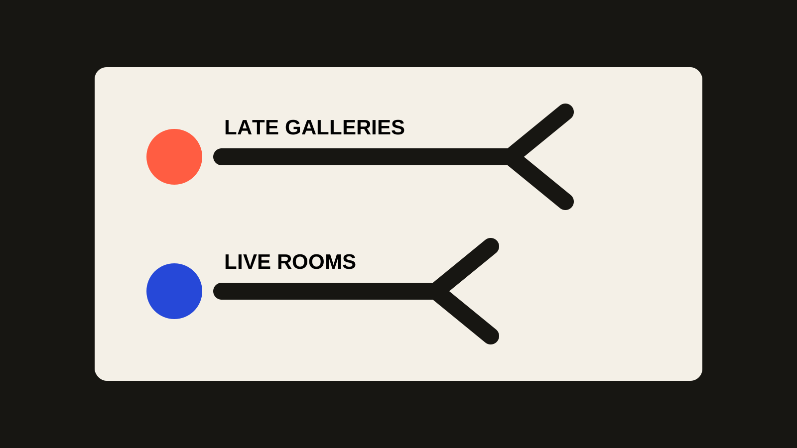
The useful problem was wayfinding as much as branding. Visitors needed to recognize the series, understand that venues were connected, and move between different kinds of events without the system flattening their personalities.
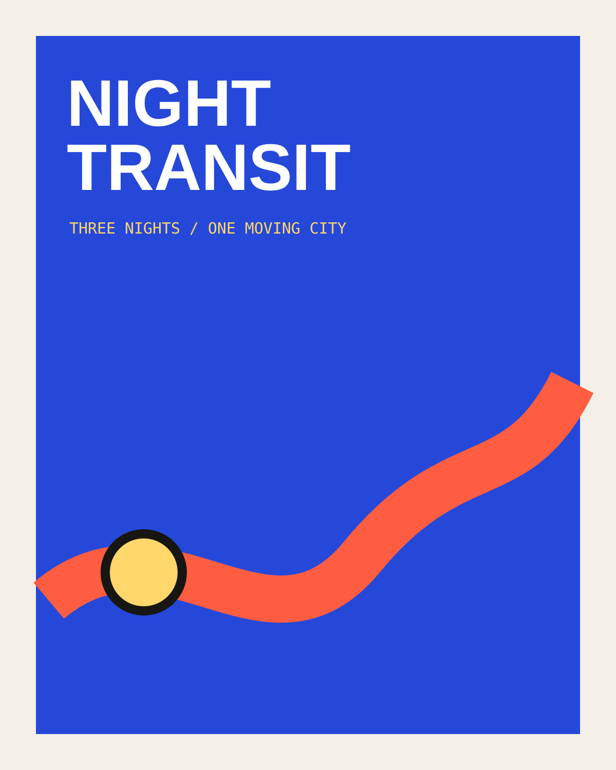
The response uses a continuous route line as the connective device. Cobalt establishes the night field; coral marks movement; butter-yellow circles behave like stops, stamps, and event markers.
Built to move.
The system changes scale easily: large route lines create poster energy, while small route dots and mono labels handle schedule information. The identity can become loud when it needs attention and quiet down when information density increases.
Constraints became the language.
Route line before logo. The connective graphic does more work than a decorative mark, so it leads the campaign.
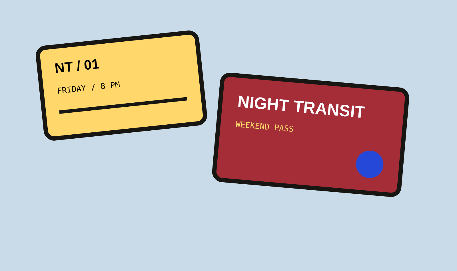
Information stays rectangular. Event details live in clear cards while the route creates motion around them.
Color is functional. Yellow marks destinations; coral marks movement; cobalt carries the night context.
Next
The rest of the portfolio stays intentionally compact.
Rather than fabricate long case studies for every project, this concept gives one project the deeper narrative and lets the work index establish breadth.