What can I eat?
Readable dishes, prices, service periods, and useful dietary context.
 Lowbird Kitchen
Kitchen & room
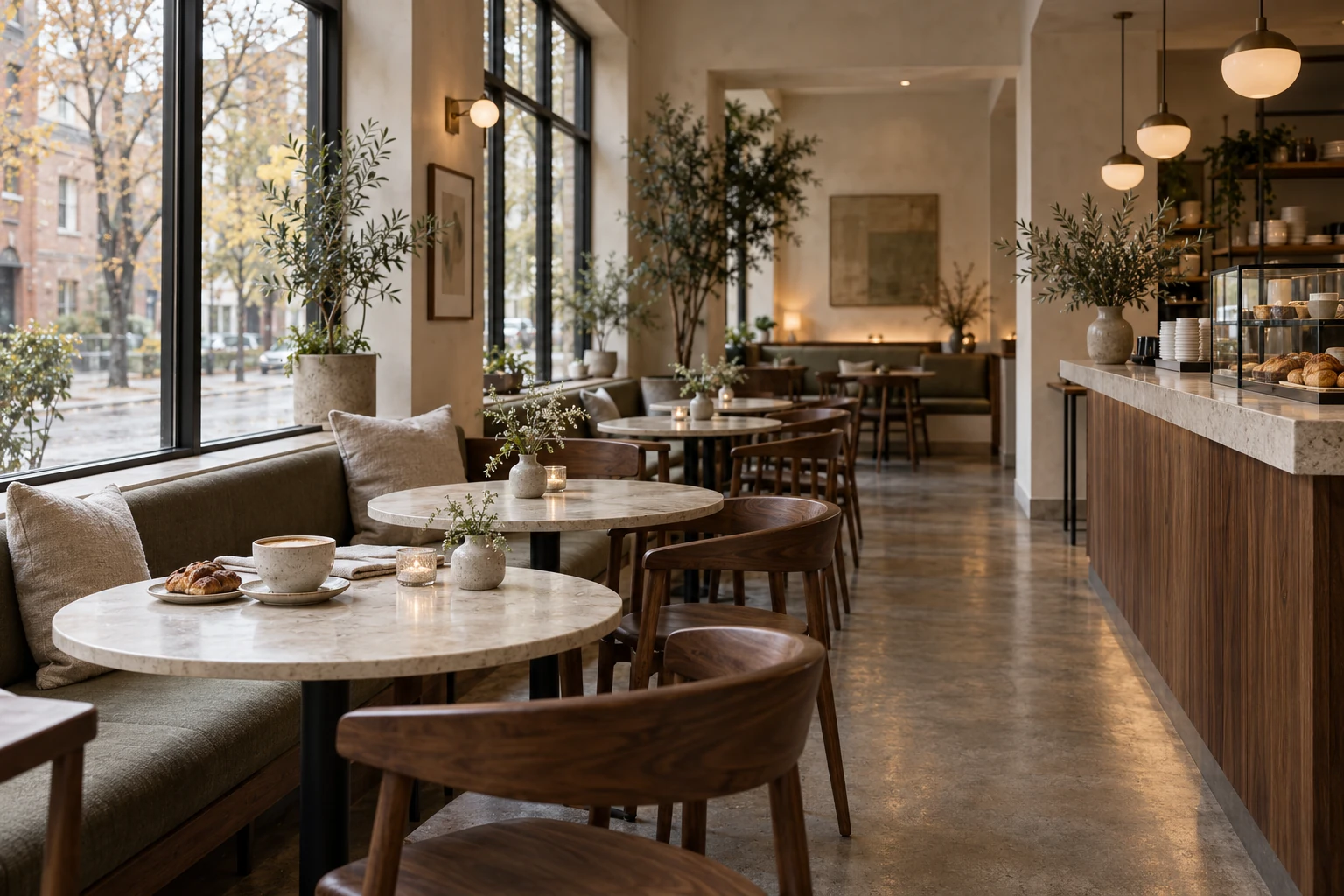
The brand story is intentionally practical: short menu, warm room, straightforward service, and enough detail online that a guest knows what kind of night they are choosing.
The idea
Lowbird’s fictional kitchen changes ingredients as the season shifts, while keeping a familiar structure: a handful of small plates, three or four mains, and weekend brunch. The website mirrors that restraint instead of burying diners in categories.
No fake chef biography, awards, sourcing claims, or years-in-business are used. The concept demonstrates tone and information architecture rather than fabricated authority.
Service principles
Strong restaurant UX is mostly about reducing uncertainty quickly.
Readable dishes, prices, service periods, and useful dietary context.
Hours and service windows should be explicit rather than implied.
Make walk-in and reservation expectations visible before the guest commits.